Lucky Cuff Quilt

by Dorie on December 7, 2016

I am so pleased to have designed December’s Quilt of the Month for the MQG!

From the blurb:

This quilt is inspired by colorwork knitting patterns and my childhood love of Lucky Charms cereal. I have been enjoying making row quilts, and being a knitter as well as a quilter, the correlation between knitted and quilted rows is cool to me. In knitting we always have the restriction of the row, and it’s interesting to observe how knitters have worked with that restriction and to translate it into quilting.

My great grandmother used to let me eat all kinds of junk my mom didn’t want me to have, including Lucky Charms cereal. She was also pretty tolerant about us doing wasteful, messy things, like removing the colored marshmallows from the milky bowl to “stamp” leeched food coloring designs on napkins. She even put the finished napkins on her fridge. So, this quilt is all happy food memories meet knitting meets quilting.

The pattern makes a twin size quilt – certainly big enough to get under. I used Kona cotton solids for my quilt, in shades of blue-green, and I backed it in a small print gingham.

For the quilting, I decided to do a pattern inspired by knit stockinette stitch similar to the one I used on my Knit Stitch quilt.

The lovely and talented Hayley Cason of The Plum Bobbin pattern tested and edited my pattern. She’s has both an English degree and a ton of technical quilting experience, and this pattern definitely benefitted from her work. Thank you Hayley!

{ Comments on this entry are closed }

confetti cottons basket stripe pillows

by Dorie on July 8, 2016

I’m really happy to be a part of Riley Blake’s Quilt-It Modern blog tour! Riley Blake has added some new colors to their Confetti Cottons, and they took the opportunity to partner with some excellent quilters to show them all off.

I wanted to make some pillows based on my Fresh Pack quilt (which is based on basketweave style knitted rib). I decided to take the number of colors I used down to almost just two, but then to keep color in the flying geese rows.

I didn’t want to go with stark black and white, but I wanted to be close and to have a lot of contrast, so I used Riley Blake’s off-white “Cloud” with “Licorice” in one pillow and “Riley Navy” in the other.

I had a whole slew of blues and green to choose from – such great colors. I might still make a pillow (or a mini!) that just uses the blues and green. Time, you know? Two pillows will have to do for now, and my couch will thank me.

I’m at the very end of the tour, but you might want to take a look at the other projects on the tour:

6/27 – A Bright Corner

6/27 – Salty Oat

6/28 – Trillium Design

6/28 – Allison Sews

6/29 – A Quilter’s Table

6/29 – Bonjour Quilts

6/30 – Euphoria Jessica

6/30 – Material Girl Quilts

7/1 – Samelia’s Mum

7/1 – Sassafrass Lane

7/5 – Quilt Matters

7/5 – During Quiet Time

7/6 – Sometimes Crafter

7/6 – Modern Handcraft

7/7 – Orchid Owl Quilts

7/7 – Piece and Quilt

7/8 – Sew Katie Did

7/8 – Tumbling Blocks

7/8 – Leigh Laurel Studios

Thanks Riley Blake!

{ Comments on this entry are closed }

LaCroix quilt, LaCroix love

by Dorie on May 26, 2016

LaCroix Quilt, close

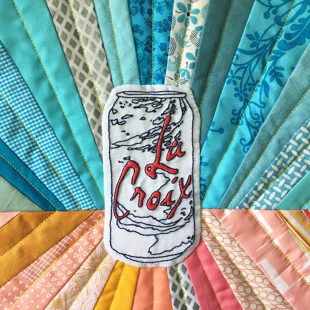
I made a LaCroix quilt… because it is really, truly the beverage of my dreams. (And, I was prompted by the Ann Arbor Modern Quilt Guild’s Foodie Challenge. We’re hanging our quilts in Zingermans!) I embroidered the LaCroix can, and I chose colors inspired by my two favorite flavors: pamplemousse and plain, aka pure.

And maybe you’re asking yourself, “Really? Really, this drink is so good that you will hand embroider a logo? You will give this corporation a piece of your handmade soul? Aren’t we just a step away from having a living room decorated in a Coca-Cola theme here? What is going on?”

I’ll explain.

You have to get beyond the package to love the package

I was introduced to LaCroix by my friend Kristin. (Kristin is the same person who taught me how to enjoy beer, but that is a different story.) It wasn’t a tricky introduction – she had cold cans in her fridge, offered me one, and I accepted. This was when I lived in Illinois, after having recently moved from the DC area. I had seen the cases of LaCroix at the grocery store, but I avoided them because they looked like something “diet”. The splashy paint and candy colors of the packages said, “aspartame here!”, “fake flavor flavor!”, and “Cheryl Tiegs 90s yogurt!” So when I tried my first LaCroix at Kristin’s house I was surprised to learn, “Oh, this is seltzer!”

Cold can experience

A cold can of LaCroix is entirely refreshing. It is fizzy and uplifting, physically and mentally. When you drink a cold can of LaCroix, you are having a cold can experience.

LaCroix is a special drink

…but it’s not. LaCroix just feels like having a special drink. In the doldrums at work? Have a LaCroix. Want the bubbly fresh feeling of kombucha but don’t want to spend 4 bucks? Have a LaCroix. Feel like having a beer but don’t want the calories and/or this is not a socially acceptable time to have a beer? Have a LaCroix. Want to savor the afternoon in your backyard? Have a LaCroix.

No joke, the first sip of a LaCroix and the first sip of a cocktail give me the same deep breath feeling. I know that’s all in my head, but isn’t half of having a cocktail the state of mind? And, equally good, LaCroix pairs well with other people drinking. At a party but not imbibing? LaCroix makes you feel like you’re in on it too.

LaCroix Quilt

LaCroix is not fancy

Despite what hashtag socality type instagram photos might have you believe, LaCroix is not fancy. It is from Wisconsin! How not fancy is that?! I love it, so much, that this special beverage is Midwestern. It comes in 12 packs (which go on sale at the grocery) and it costs about 40 cents a can. You might think that its 90s style labels are too-cool-for-school hipster, but LaCroix is just out there being genuine. I’m sure the label is part of LaCroix’s rise in popularity and of what makes LaCroix more than just seltzer. It confuses people, like it first confused me. We have come to expect a gimmick in our boughten beverages, and we are surprised when that can contains honest, flavored sparkling water.

Isn’t it just seltzer?

I grew up in New Jersey, and a couple years ago when we drove home for the Christmas, I left a can of LaCroix in my mom’s garage fridge. When I was back visiting in the summer the can was still there. The can was so weird and foreignly Midwestern that nobody wanted to touch it. Now, what you may or may not know is that New Jersey is a seltzer-drinking place. I grew up drinking seltzer – it was Vintage or Foodtown generic brand and it was in a bottle. So, even though my mom’s fridge saw plenty of other sparkling water pass through it, the LaCroix remained untouched, because LaCroix is just a little different, even if it’s not.

New Jersey friends feel the same way about Vintage that I feel about LaCroix. I try to convince them about LaCroix and they give me side eye, even when I bring up the glory of pamplemousse. I got one friend to do a side-by-side lemon-lime taste test, and the verdict was that LaCroix was more subtle. This might be why I like it and it why she prefers the other.

Her: Yeah, but you have to love Vintage for the real New Jersey thing.
Me: (pamplemousse look of skepticism)
Her: OK, but the real New Jersey Jewish thing?

OK, she’s right there. The cultural seltzer drinking I grew up with knows nothing about LaCroix, and I am not going to mess with those traditions. It would be very not Midwestern of me to try to insert my Midwestern influence over other people. If I were still a New Jerseyan, I would be distrustful of LaCroix too. Because in New Jesey at Wegmans (grocery), they sell LaCroix on the fancy organic stuff aisle. What is that about? We all know LaCroix is not fancy. Distrust.

Pamplemousse

Why is the grapefruit flavor of LaCroix in French? We don’t know, but we like it. Pamplemousse is delicious, my favorite, and I love it forever. Most of the LaCroix flavors are great. Some are terrible. And Coconut leaves us highly divided. Personally, I stick with the flavors that come in the standard can shape. I am really not so sure about the LaCroix Cúrate. I feel like those skinny cans are trying to sell me something because I’m a woman, like the Virginia Slims of sparkling water. Just because you’re my favorite beverage doesn’t mean I’m not giving you the critical eye.

Corporate poetry

In getting ready to write this post, I did a little research about LaCroix and its parent company, National Beverage. I mostly wanted to make sure that they weren’t doing evil things that I didn’t know about. They seem like a pretty regular company. However, they have an amazing, poetic annual report. (NASDAQ “FIZZ” btw, so cute.) Some highlights:

“NATURALLY CREATIVE, DYNAMICALLY
INNOVATIVE AND . . . MINDSET!”

“Just believe . . . if we, who produce for ‘stomachs’, are conscious enough while conscience-guided to use our billboards and factories to give wholesome choices . . . isn’t that our patriotic purpose? I know so . . .”

If you love LaCroix, I would recommend reading the whole thing. More than that, I would recommend reading the whole thing out loud, dramatically, to other people who love LaCroix. You won’t be disappointed.

LaCroix selfie

Where does this leave us?

At the end of this post I find myself saying, “You had a lot to say about that.” I am a little judgey of self. There is so much going on in our world, big and little, that I do feel a little silly devoting time and energy to a fizzy drink. But, maybe that’s the root of it. LaCroix is a beautiful escapist beverage. I think that’s why we love it. Crack open a can and just for a minute, you’re on vacation, the world is sane, and it’s all sunshine and sprinklers and rainbows.

{ Comments on this entry are closed }

pegasus quilt

by Dorie on March 7, 2016

pegasus quilt

This quilt is all about these joyful colors and just how happy-making the Anna Maria Horner pegasus-as-backgroud fabric is.

My fabric choices for the log cabins were inspired by couple of new fabric bundles that made their way into my stash: Carakai by Carolyn Friedlander (a present from Jenna!) and a particularly good assortment of Blueberry Park fabrics from Sew Modern. I mixed in a little Lizzie House, Heather Ross, and fabric that, for crying out loud, doesn’t even have a known designer.

log cabins and winged horses

I pieced the quilt at the Ann Arbor MQG winter retreat. Because I wanted to be able to just sit and sew as much as possible, I calculated and cut all the strips for the log cabins at once. No improv here, just tidy little piles of strips of certain lengths. The outer strip of the quarter log cabins in each block is a white-on-white print. I was hoping this would unify them all and provide some space before the winged horses come in.

{ Comments on this entry are closed }

Scraps, Inc. Vol.2, Chimney Swifts Quilt

by Dorie on February 10, 2016

Scraps, Inc. Vol.2

I am really excited to be a part of Scraps, Inc. Vol. 2 from Lucky Spool! This book is beautiful – the palette is soft and bright and is making me think of spring. And, it’s filled with 15 different patterns – each from a different designer – for quilts to make using your leftovers, small cuts, and what have you.

Chimney Swifts Quilt
photo by Nydia Kehnle

This is my quilt, Chimney Swifts, named for the little birds that flutter around our rooftop in the summertime. It’s a row quilt (I do love row quilts!) and is built from straight lines and varying triangles. I liked the idea of solid foundations at the top and bottom with an airy space for the “birds” to meet in the middle.

photo by Nydia Kehnle

I had garment sewing leftovers on the mind when I was making this quilt. When you’re cutting out a garment, you get funny-shaped scraps, and I thought the equilateral triangles in this quilt would be a good way to use those up. Also, I think the rectangles could easily be made from leftovers where yardage requirements weren’t always spot on. Embracing the garment idea, I made this quilt from a variety of fabric types: voile, double gauze, light linen canvas, woven cottons, and of course good old quilters cotton.

kitty face

Although the background of the triangles area reads white, it’s peppered with little scrappy bits. Like this kitty! One of my favorite things about scrap quilts is how they lend themselves to little surprises.

Would you like a copy of Scraps, Inc. Vol.2? Lucky Spool is offering a fabulous presale of 30% off until February 16th. Just use the code “Scraps30” on the Taunton site. And, Lucky Spool is kindly giving away a copy of the book, right here, right now. To be entered to win, please leave a comment before noon eastern time on Saturday, February 13th.

Chimney Swifts Quilt
photo by Nydia Kehnle

Want to see more quilts from the book? Check out the blog tour!

Monday, February 8

Amy Smart, Diary of a Quilter

Nydia Kehnle, Nydia Kehnle Design + Photography

Tuesday, February 9

Amy Friend, During Quiet Time

Alexandra Ledgerwood, Teaginny Designs

Wednesday, February 10

April Rosenthal, April Rosenthal – The {Studio} Blog

Dorie Schwarz, Tumbling Blocks

Thursday, February 11

Erin Harris, House on Hill Road

Janice Ryan, Better Off Thread

Friday, February 12

John Adams, Quilt Dad

Kari Vojtechovsky, Craft Happy

Saturday, February 13

Katie Blakesley, Swim Bike Quilt

Kati Spencer, From the Blue Chair

Sunday, February 14

Melissa Lunden, Lunden Designs

Allison Harris, Cluck Cluck Sew

Sherri McConnell, A Quilting Life

{ Comments on this entry are closed }

tree of drunks, a temperance quilt

by Dorie on November 29, 2015

Tree of Drunks Quilt

This quilt, Tree of Drunks, is the third in a series of temperance quilts I’ve made. With this quilt I was particularly thinking about the temperance movement and relationships. Those who were a part of the temperance movement overlapped with the abolitionists and the women’s rights movement. Calls for social reform in one area inspired activism in others.

I merged two patterns commonly used by temperance quilters (Tree of Life and Drunkard’s Path) into one block. I really love the resulting samara-shaped drunkard and half-square-triangle blocks. (Imagine them falling down from the trees as little helicopters). I wanted to focus on that shape, so I worked in just the two “temperance” colors using Kona white and blue peppered cotton.

Tree of Drunks detail

The beautiful quilting is done by Lynn Carson Harris. I wasn’t exactly sure how to quilt it, and thought that maybe we’d want some play of the quarter circle shape. Lynn came up with a design of interlocking groups of straight lines around varying size quarter circles. I really love it, and I think it suits the quilt perfectly.

Other quilts in this series:

{ Comments on this entry are closed }

prairie stars, the 10 year anniversary quilt

by Dorie on October 20, 2015

prairie stars 10 year quilt

This quilt is for my husband. I made it for our 10 year anniversary, and I’m so proud of it, and of us.

quilting detail, star quilt

Elie has a good eye, and I’ll often ask for his opinions when I have a quilt design laid out. Sometimes, he wants to know why there are so many different colors. His favorite quilts use a limited palette and have a clear geometric design. To find the perfect quilt for him, I went looking through books of old quilts for inspiration. I considered a lone star, but decided on this four star pattern. (One book called it “prairie stars”.) I love the secondary patterns that appear at the intersections of the stars. It’s both delicate and sturdy.

anniversary quilt

I used Kona cotton in charcoal and snow and backed it in a smooth, soft, lighter weight white backing from Moda. That backing is so snuggly, and the lighter weight makes it so you don’t feel trapped under a queen size quilt. Making a quilt intended for everyday use on a bed, I was thinking of comfort and practicality as well as design. I went with just a central patchwork design for easy cleaning. I know where the cat sits and the dangers of benzoyl peroxide.

The quilt is quilted in straight lines, first echoing the central patchwork, and then filling in with parallel lines behind it.

prairie stars quilt with my lovely helpers

It’s a really big deal, and I love him to pieces.

{ Comments on this entry are closed }

roundabouts baby quilt

by Dorie on August 19, 2015

roundabouts baby quilt

I totally fell in love with Amy Gunson’s Roundabouts quilt pattern. I saw it for the first time in Amy’s umbrella prints trimmings contest entry, which won for very good reason! I bought the pattern right away – it was like that.

And I pulled it out after searching my mind for the ideal baby quilt for my sister, who is expecting! I love that the design is geometric, but delicate. All those little pieces are so perfect for highlighting sweet, special fabrics. I included some scraps from a 1950’s pair of pajamas that belonged to my aunt and which my sister also wore. Hording vintage fabrics sometimes works out ok.

vintage flannel cat pajamas

I really love to the result and I hope my soon-to-be niece or nephew will put it to good use!

{ Comments on this entry are closed }

umbrella prints trimmings quilt

by Dorie on May 27, 2015

Umbrella Prints Trimmings Quilt

I’ve seen so many cool things come out of the umbrella prints trimmings contests of past years. So glad I got to take part this year!

umbrella prints trimmings packets

I bought two packets of trimmings – one for now and one for later – and decided to use the rust/salmon/coral packet in my quilt.

trimmings triangles details

I didn’t immediately know where I wanted to go with the project, so my packet waited on the bedside table. Then Lynn’s book, Every Last Piece and Sherri Lynn’s book, The Improv Handbook for Modern Quilters arrived at my house at about the same time. The resulting quilt is a mash-up – it’s what I’d make under their collective influence!

umbrella prints trimmings quilt, square

My quilt uses the flying geese modern block score from Sherri’s book and uses the ring layout of one simple shape from Lynn’s pattern, “Don’t Fence Me In”. Both authors encourage you to play and to try different takes on their techniques and patterns, which I really appreciate. It’s good when a book inspires you to do your own thing. And, for goodness sake, I really like both those women.

trimmings, figuring the upside

I surprised myself by picking up the gold colors from the packet. The trimmings I got would have looked equally beautiful in a more neutral (ahem, gray) quilt. But, I had this Robert Kaufman dotted denim that I had been thinking of using with a hand print, and I really really like it, so it seemed perfect. And that denim and salmon and gold all really liked each other.

me and the trimmings quilt

Thanks to umbrella prints for putting on a fun contest. I’ve seen some of the other entries so far and they are really great. Can’t wait to see the rest!

{ Comments on this entry are closed }

gemerations

by Dorie on March 10, 2015

quilting near the point

I’ve always loved challenge projects – it can be energizing to work with a set of rules and a deadline – so I was happy to hear about the Chicago-Area Modern Quilt Guild Friendship Star Challenge for International Quilt Festival in Chicago. The challenge rules were simple: at least 36 inches on each side and based on the friendship star block. It’s pretty cool that Quilt Festival has this modern challenge, so why not give it a go, right?

I found that friendship star to be pretty difficult to work with. It’s chunky blocky. It wants to move in one direction. Camille Roskelley’s “Round and Round” layout uses friendship stars in a ring kind of perfectly already, so nothing like that. I didn’t like much of what I was doodling and I got totally stumped. This was a Saturday, and I was drawing and groaning at the table with my daughter, Eva, who was doing homework and complaining less. She’s in high school now, and while she has always had an artistic point of view, I find that I go to her more and more with design questions. I trust her design sense. It’s so helpful to have another set of eyes when you are hating what you’re making.

loops and lines quilting

The design I liked best so far was one where I had 4 stars facing each other, with the outermost arm of each star chopped off. (I figured that if I didn’t love the friendship star shape, the best thing to do was change it some.) This left a chunk of whitespace in the center, and I wasn’t quilt sure what to do with it. Another star? Leave it blank?

gemerations quilt

Really, the quilt is largely Eva’s design. I would have given up without the push of making something together. It was Eva’s idea to put a gem in that middle spot there. She sketched it out for me, picked the colors, and helped figure out what went where. For colors, we started out with a bigger stack that also included amethyst, jade, and aquamarine – very “Hall of Minerals” – but then we pared down to all peachy pinks and gray blues. I never mind falling back to gray blue.

We named the quilt Gemerations, because we are corny on purpose. It will be at Quilt Festival, and I’m thinking we might plan a little trip to get there too!

{ Comments on this entry are closed }